Tutorial for PARAFAC2-RISE on scRNA-seq Data
This tutorial demonstrates the complete RISE workflow for analyzing single-cell RNA-seq data across experimental conditions.
Installation
To add scrise to your Python environment, install it from PyPI:
For GPU acceleration support (propagated to parafac2[gpu]):
Preprocessing the Dataset
Input Requirements
Your AnnData object must meet the following requirements:
- Condition Index: Include an observations column
condition_unique_idxsthat is a 0-indexed array indicating which condition each cell is derived from, along with the cell barcode. Condition 1 cells are indexed as 0, Condition 2 as 1, and so on. - Preprocessing: Your AnnData object must be preprocessed (doublets removed, genes filtered, normalized, and log-transformed) before running the algorithm. The
prepare_datasetfunction can assist with preprocessing for gene filtering, normalization, and assigningcondition_unique_idxs.
Using prepare_dataset
The prepare_dataset function assists with preprocessing your data. Parameters:
X: AnnData object containing raw count data in sparse matrix formatcondition_name: Name of the column inX.obsthat specifies experimental conditions for each cellgeneThreshold: Minimum mean expression threshold for gene filtering (genes with mean expression below this value are removed)deviance: If True, applies deviance transformation instead of log normalization (default: False)
The function performs the following steps:
- Filters cells with fewer than 10 total counts
- Filters genes based on the
geneThresholdparameter - Normalizes total counts per cell to the median
- Scales gene expression values
- Applies \(\log_{10}((1000 \times \text{normalized\_value}) + 1)\) transformation (or deviance transformation if specified)
- Creates
condition_unique_idxscolumn inX.obswith 0-indexed condition assignments - Pre-calculates gene means and stores in
X.var["means"]
Import and Prepare the Dataset
Import your dataset as an AnnData object with preprocessed data.
Choosing the Rank
Assess Variance Explained by RISE and PCA
Determine the optimal component/rank by plotting the variance explained (\(R^2X\)) across different ranks for both RISE and PCA. This helps balance model complexity with explanatory power.
import matplotlib.pyplot as plt
from scrise.plotting import plot_r2x

ranks = [1, 5, 10, 15, 20, 25, 30]
fig, ax = plt.subplots(figsize=(5, 5))

plot_r2x(X, ranks, ax)
plt.tight_layout()
plt.show()
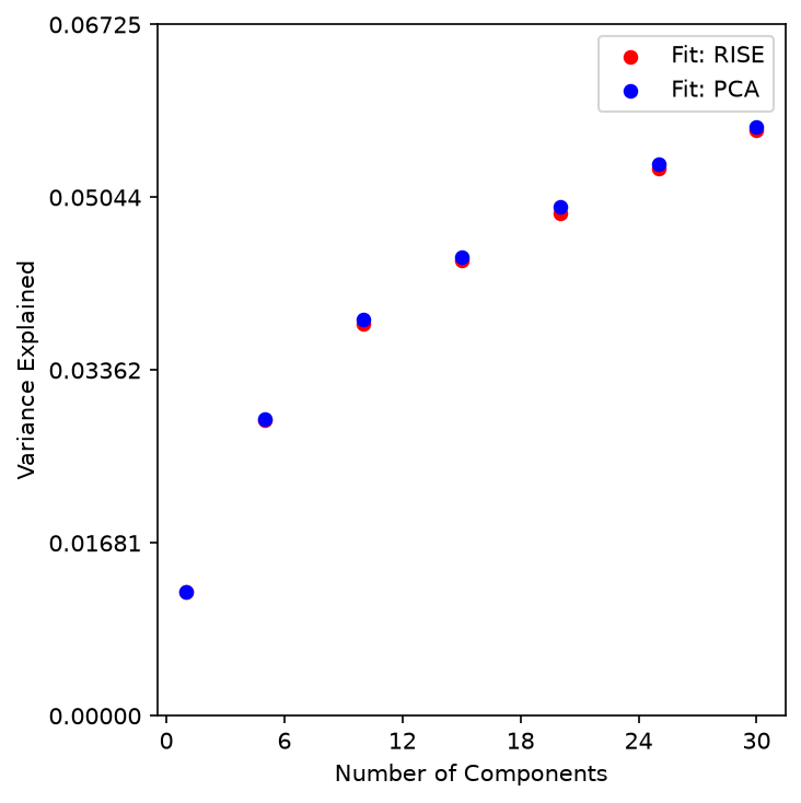
Evaluate Factor Stability with Factor Match Score (FMS)
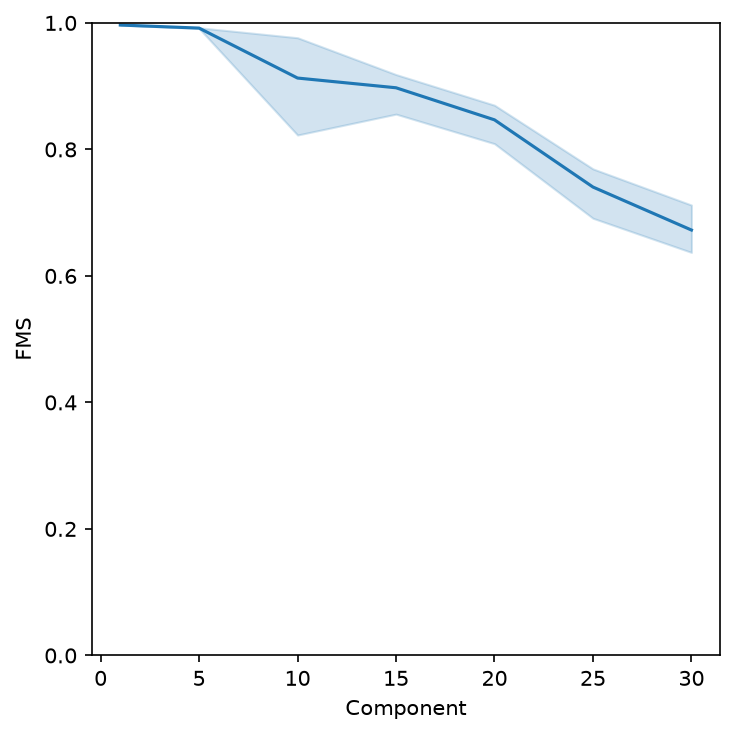
Measure the reproducibility of the RISE factorization across different ranks. An FMS above ~0.6 indicates stable components.
import matplotlib.pyplot as plt
from scrise.plotting import plot_fms_diff_ranks

fig, ax = plt.subplots(figsize=(5, 5))
rank_list = list(ranks)

plot_fms_diff_ranks(X, ax, ranksList=rank_list, runs=3)
plt.tight_layout()
plt.show()
Select a Rank with Bi-Cross-Validation (BiCV)
\(R^2X\) (in-sample fit) always increases with rank, so it cannot by itself identify an optimal rank. Bi-cross-validation (BiCV) addresses this by holding out a random subset of cells and genes, fitting RISE on the remaining data, and scoring how well the fit predicts the held-out block. Because it is evaluated on unseen data, BiCV \(R^2X\) penalizes overfitting and turns over near the rank that generalizes best, unlike the fit \(R^2X\).
scrise.rank_selection.bicv exhaustively evaluates a list of candidate ranks, each with several repeated random train/test splits, and returns both the fit \(R^2X\) and the BiCV \(R^2X\) for every rank so you can inspect the full curve. Since PARAFAC2 fits use CANDELINC compression by default (compress="auto"), sweeping every rank in this way is cheap enough that there is no need to search for the best rank without evaluating every candidate.
import matplotlib.pyplot as plt
from scrise.plotting import plot_bicv_r2x
from scrise.rank_selection import bicv

ranks = [5, 10, 15, 20, 25, 30]
results = bicv(X, ranks, n_repeats=3, random_state=0)

fig, ax = plt.subplots(figsize=(5, 5))
plot_bicv_r2x(results, ax)
plt.tight_layout()
plt.show()
bicv returns a long-form DataFrame (columns Rank, Repeat, Metric, R2X, plus the per-trial diagnostics below) suitable for further analysis as well as plotting. Each BiCV trial holds out held_out_cell_frac of the cells within each condition and held_out_gene_frac of the genes. Both default to 0.5, the half-rows-and-half-columns split recommended by Owen and Perry, who report that "in simulated examples we find that a method leaving out half the rows and half the columns performs well". Increase n_repeats for a smoother, less noisy BiCV curve at the cost of more compute.
Each BiCV row also carries the diagnostics needed to audit the curve rather than just plot it:
| column | what it is for |
|---|---|
Train Block R2X |
In-sample \(R^2X\) on the block the model was fit to. A positive interpretation is typically this metric climbing while the held-out \(R^2X\) turns over. |
NTrainGenes, NTestGenes, NTrainCells, NTestCells |
The realised block sizes which set the scale of the spread across repeats. |
Seed |
The seed that determines the trial's splits and initialisation, so a single trial can be replayed on its own. |
# Does the held-out score turn over while the in-sample one keeps climbing?
trials = results[results["Metric"] == "BiCV R2X"]
print(trials.groupby("Rank")[["R2X", "Train Block R2X"]].mean())
If you plan to fit the final model with non-default parafac2_nd options (e.g. normalize_slices=True, see Handling Unequal Cell Counts), pass the same options to bicv via parafac2_kwarg so that rank selection is evaluated under the same fitting behavior:
compression_kwarg similarly forwards extra options (e.g. n_power_iter) to the CANDELINC compression step; it requires compress to also be set.
Running the Factorization
Perform RISE Factorization
Based on the variance explained and FMS, select a rank and perform the RISE factorization. This decomposes the data into condition, eigen-state, and gene factors.
from scrise.factorization import pf2

rank = 20
X = pf2(
    X=X,
    rank=rank,
    doEmbedding=True,
    tolerance=1e-6,
    max_iter=100,
    random_state=42,
)
The function pf2 performs PARAFAC2 tensor decomposition on the AnnData object. Parameters:
X: AnnData object with preprocessed scRNA-seq datarank: Number of components to extractrandom_state: Random seed for reproducibility (default: 1)doEmbedding: If True, automatically computes PaCMAP embeddings of cell projections and stores inX.obsm["embedding"](default: True)tolerance: Convergence threshold for the optimization algorithm (default: 1e-6)max_iter: Maximum number of iterations (default: 100)
The output of pf2 includes the original AnnData object with added results and the reconstruction error (\(R^2X\)). The following are added to the AnnData object:
- Weights:
X.uns["Pf2_weights"]- The weights for each component - Condition Factors:
X.uns["Pf2_A"]- Factors with respect to conditions - Eigen-state Factors:
X.uns["Pf2_B"]- Eigen-state factors - Gene Factors:
X.varm["Pf2_C"]- Gene factors (matrix width equals the rank) - Projections:
X.obsm["projections"]- Cell projections for each component (matrix width equals the rank) - Weighted Projections:
X.obsm["weighted_projections"]- Weighted projections for each cell across all components, determining how each cell relates to each component pattern - PaCMAP Embedding:
X.obsm["X_pf2_PaCMAP"]- 2D visualization embedding of cell projections (ifdoEmbedding=True)
Saving and Loading Factorization Results
Single-cell datasets often contain tens of thousands of cells and genes, resulting in multi-gigabyte files when saving raw expression matrices alongside decomposition results. To enable lightweight sharing and fast downstream analysis, RISE includes built-in functions for exporting and loading factorizations:
- Optimized Product Quantization (OPQ): Compresses the continuous per-cell projection matrix (
X.obsm["projections"]) to compact 8-bit quantization codes while guaranteeing high reconstruction fidelity (\(R^2 \ge 0.99\)). - Deterministic Reconstruction: Factor matrices (
Pf2_A,Pf2_B,Pf2_weights,Pf2_C) are stored in single precision (float32), and weighted projections are deterministically reconstructed on load via \(\text{projections} \times \text{Pf2\_B}\), eliminating redundant data on disk. - Barcode Index Compression: String cell barcodes are compressed into chunked gzip byte matrices to minimize HDF5 overhead.
1. Exporting Factors to Disk
Use export_factors to save decomposition factors and cell projections to an .h5ad file:
from scrise import export_factors

# Export factors and compressed projections
export_factors(
    X,
    filename="thomson_factors.h5ad",
    fidelity_threshold=0.99,  # Target R^2 reconstruction fidelity (default: 0.99)
    random_state=42,
)
This produces a compact file (~4-5 MB for ~30,000 cells) containing all factor matrices, cell metadata, and PaCMAP coordinates, without bundling the uncompressed raw count matrix.
2. Loading Factors for Fast Downstream Analysis
Use load_factors to load the saved decomposition. Projections are decoded from OPQ codebooks and weighted projections are automatically recalculated:
import matplotlib.pyplot as plt
from scrise import load_factors
from scrise.plotting import plot_condition_factors, plot_labels_pacmap

# Load factor results into an AnnData object
factors = load_factors("thomson_factors.h5ad")

# Access reconstructed factor matrices and projections
print("Condition factors shape:", factors.uns["Pf2_A"].shape)
print("Gene factors shape:", factors.varm["Pf2_C"].shape)
print("Cell projections shape:", factors.obsm["projections"].shape)
print("Weighted projections shape:", factors.obsm["weighted_projections"].shape)
print("OPQ reconstruction fidelity R^2:", factors.uns["opq_fidelity"])

# Generate factor and embedding plots directly
fig, ax = plt.subplots(figsize=(8, 8))
plot_condition_factors(factors, ax=ax, cond="Condition", log_transform=True)
plt.show()
3. On-Demand Attachment of Raw Expression Data
When you need to visualize individual gene expression on top of embeddings (e.g., using plot_gene_pacmap) or perform differential expression, supply raw_path to load_factors:
import matplotlib.pyplot as plt
from scrise import load_factors
from scrise.plotting import plot_gene_pacmap

# Load factors and automatically match & attach raw expression matrix
X_full = load_factors(
    "thomson_factors.h5ad",
    raw_path="path/to/raw_dataset.h5ad",  # Supports AnnData and IVCSR / VCSC files
)

# Cell barcodes and gene IDs are matched automatically
print("Expression matrix shape:", X_full.X.shape)

# Now gene expression plotting functions work seamlessly
fig, ax = plt.subplots(figsize=(8, 8))
plot_gene_pacmap("MS4A1", X_full, ax=ax)
plt.show()
Visualizing the Factors
Visualize Condition Factors
Examine how each experimental condition contributes to the identified patterns. Log-transforming these factors allows for easier interpretation of condition-specific effects. Several plotting functions are available in the scrise.plotting package.
import matplotlib.pyplot as plt
from scrise.plotting import plot_condition_factors

fig, ax = plt.subplots(figsize=(8, 8))

plot_condition_factors(X, ax=ax, cond="Condition", log_transform=True)
plt.tight_layout()
plt.show()

Visualize Cell Embedding
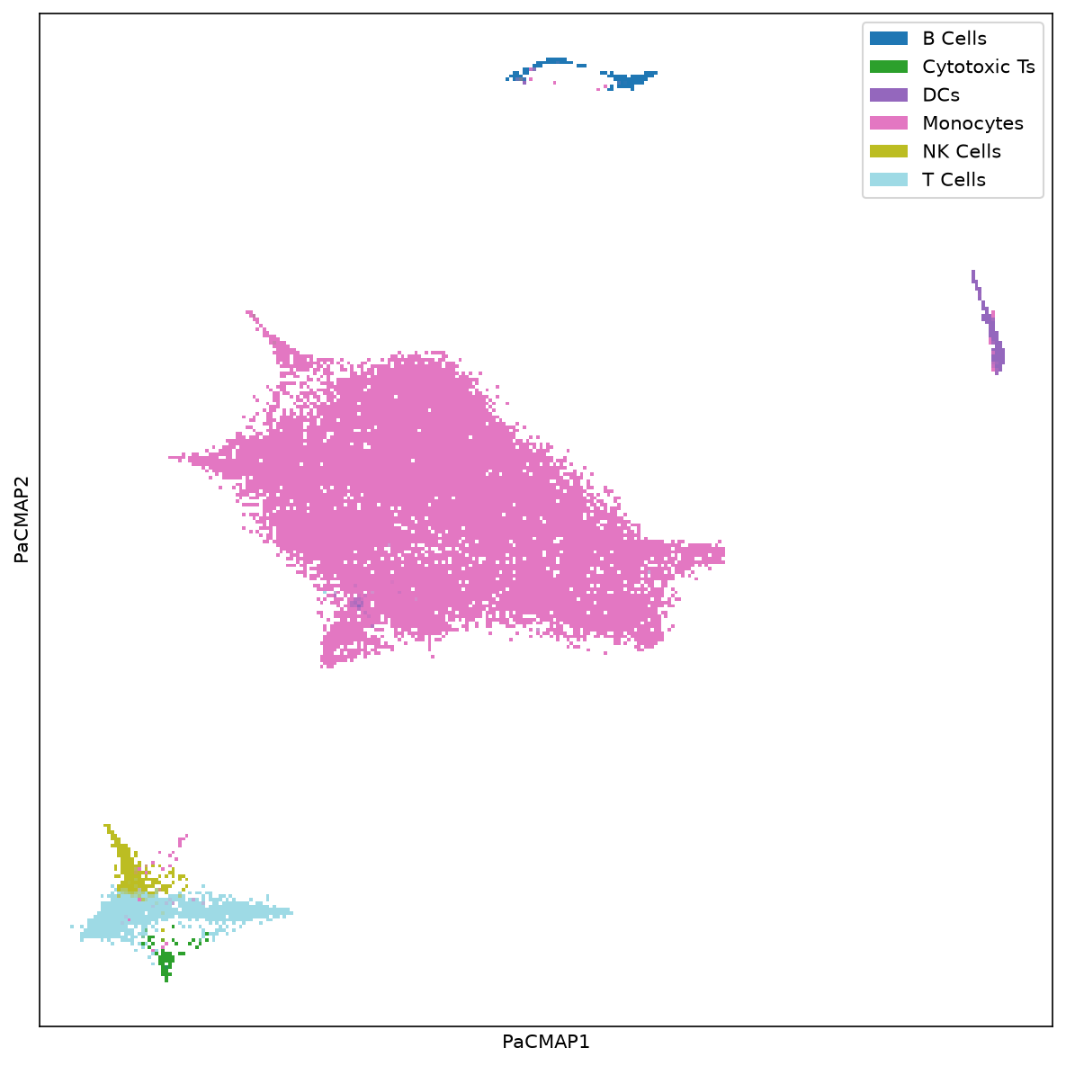
Explore the latent space of cells using nonlinear dimensionality reduction methods such as PaCMAP. Label cells by cell type or experimental condition to understand clustering patterns.
import matplotlib.pyplot as plt
from scrise.plotting import plot_labels_pacmap

fig, ax = plt.subplots(figsize=(8, 8))

plot_labels_pacmap(X, labelType="Cell Type", ax=ax)
plt.tight_layout()
plt.show()
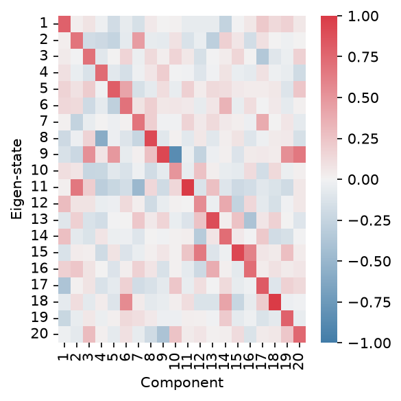
Visualize Eigen-State Factors
Analyze how each cell state contributes to the identified patterns. Each eigen-state represents a summary of similar cells with a distinct expression profile.
import matplotlib.pyplot as plt
from scrise.plotting import plot_eigenstate_factors

fig, ax = plt.subplots(figsize=(4, 4))

plot_eigenstate_factors(X, ax=ax)
plt.ylabel("Eigen-state")
plt.tight_layout()
plt.show()
Visualize Gene Factors
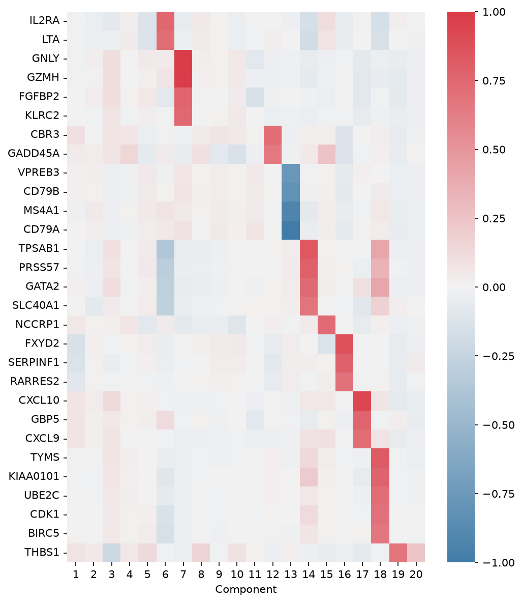
Identify which genes are highly weighted in each component, revealing coordinated gene modules. Adjust weight values to focus on genes that contribute significantly to the patterns.
import matplotlib.pyplot as plt
from scrise.plotting import plot_gene_factors

fig, ax = plt.subplots(figsize=(7, 8))

plot_gene_factors(X, ax=ax, weight=0.2, trim=True)
plt.tight_layout()
plt.show()
Interpreting a Component
Investigate Gene Associations for a Component
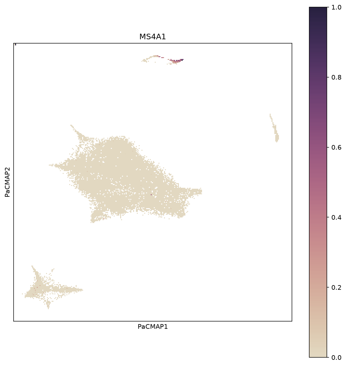
Overlay specific gene expression on the cell embedding to see which cells express genes of interest for a particular component.
import matplotlib.pyplot as plt
from scrise.plotting import plot_gene_pacmap

fig, ax = plt.subplots(figsize=(8, 8))

gene = "MS4A1"  # B cell marker
plot_gene_pacmap(gene, X, ax=ax, clip_outliers=0.9995)
plt.tight_layout()
plt.show()
Investigate Cell Associations for a Component
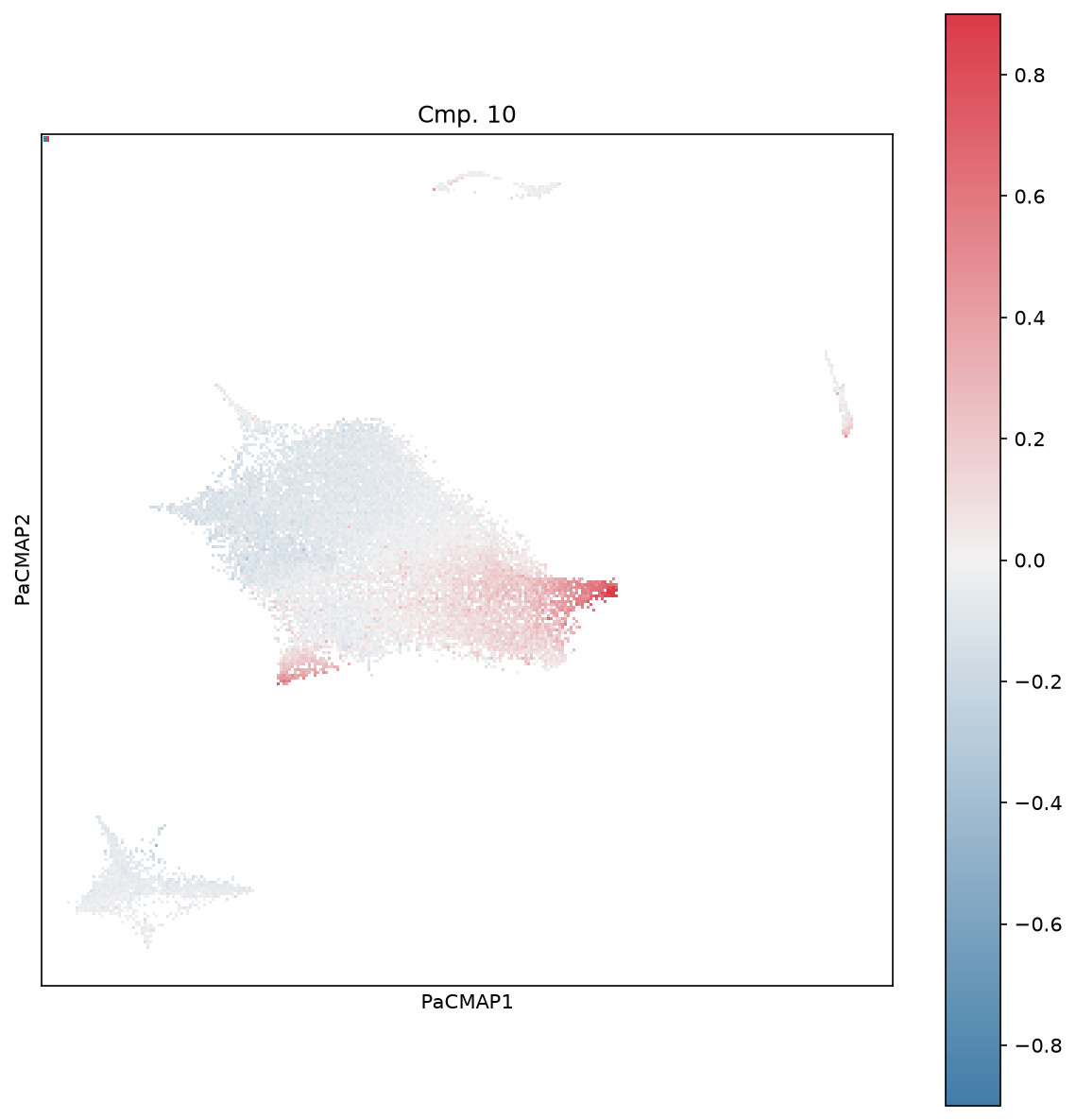
Visualize how cells contribute to specific components using weighted projections, revealing subpopulations with distinct expression patterns.
import matplotlib.pyplot as plt
from scrise.plotting import plot_wp_pacmap

fig, ax = plt.subplots(figsize=(8, 8))

plot_wp_pacmap(X, cmp=10, ax=ax, cbarMax=0.9)
plt.tight_layout()
plt.show()