Tutorial for PARAFAC2-RISE on scRNA-seq Data
This tutorial demonstrates the complete RISE workflow for analyzing single-cell RNA-seq data across experimental conditions.
Installation
To add RISE to your Python package, add the following line to your requirements.txt and remake your virtual environment:
git+https://github.com/meyer-lab/RISE.git@main
Preprocessing the Dataset
Input Requirements
Your AnnData object must meet the following requirements:
Condition Index: Include an observations column
condition_unique_idxsthat is a 0-indexed array indicating which condition each cell is derived from, along with the cell barcode. Condition 1 cells are indexed as 0, Condition 2 as 1, and so on.Preprocessing: Your AnnData object must be preprocessed (doublets removed, genes filtered, normalized, and log-transformed) before running the algorithm. The
prepare_datasetfunction can assist with preprocessing for gene filtering, normalization, and assigningcondition_unique_idxs.
Using prepare_dataset
The prepare_dataset function assists with preprocessing your data. Parameters:
X: AnnData object containing raw count data in sparse matrix formatcondition_name: Name of the column inX.obsthat specifies experimental conditions for each cellgeneThreshold: Minimum mean expression threshold for gene filtering (genes with mean expression below this value are removed)deviance: If True, applies deviance transformation instead of log normalization (default: False)
The function performs the following steps:
Filters cells with fewer than 10 total counts
Filters genes based on the
geneThresholdparameterNormalizes total counts per cell to the median
Scales gene expression values
Applies log₁₀((1000 × normalized_value) + 1) transformation (or deviance transformation if specified)
Creates
condition_unique_idxscolumn inX.obswith 0-indexed condition assignmentsPre-calculates gene means and stores in
X.var["means"]
Import and Prepare the Dataset
Import your dataset as an AnnData object with preprocessed data.
Choosing the Rank
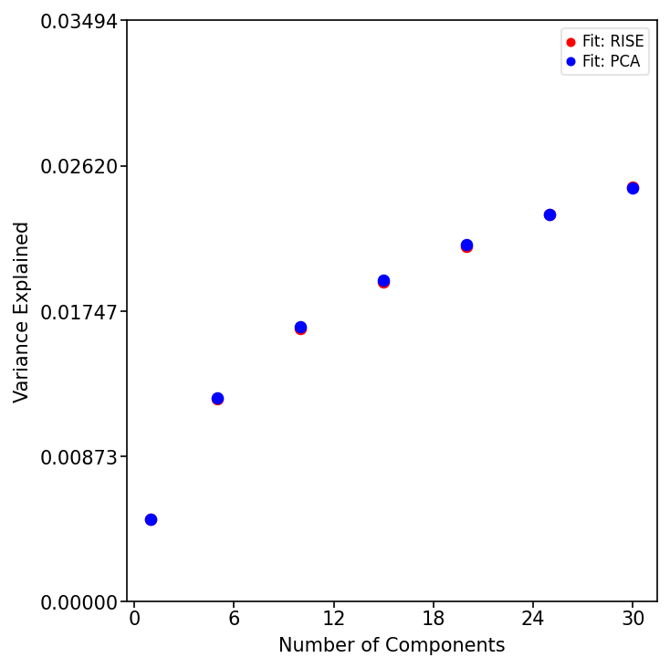
Assess Variance Explained by RISE and PCA
Determine the optimal component/rank by plotting the variance explained (R²X) across different ranks for both RISE and PCA. This helps balance model complexity with explanatory power.
from RISE.figures.commonFuncs.plotGeneral import plot_r2x
import matplotlib.pyplot as plt

ranks = [1, 5, 10, 15, 20, 25, 30]
fig, ax = plt.subplots(figsize=(5, 5))

plot_r2x(X, ranks, ax)
plt.tight_layout()
plt.show()
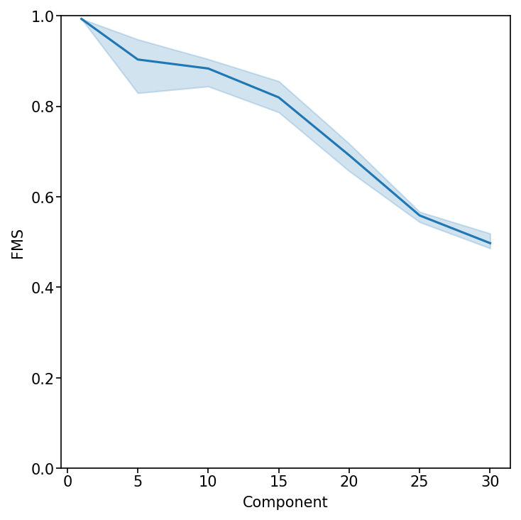
Evaluate Factor Stability with Factor Match Score (FMS)
Measure the reproducibility of the RISE factorization across different ranks. An FMS above ~0.6 indicates stable components.
from RISE.figures.figureS4 import plot_fms_diff_ranks

fig, ax = plt.subplots(figsize=(5, 5))
rank_list = list(ranks)

plot_fms_diff_ranks(X, ax, ranksList=rank_list, runs=3)
plt.tight_layout()
plt.show()
Running the Factorization
Perform RISE Factorization
Based on the variance explained and FMS, select a rank and perform the RISE factorization. This decomposes the data into condition, eigen-state, and gene factors.
from RISE.factorization import pf2

rank = 20
X = pf2(X=X, rank=rank, doEmbedding=True, tolerance=1e-9,
        max_iter=500, random_state=42)
The function pf2 performs PARAFAC2 tensor decomposition on the AnnData object. Parameters:
X: AnnData object with preprocessed scRNA-seq datarank: Number of components to extractrandom_state: Random seed for reproducibility (default: 1)doEmbedding: If True, automatically computes PaCMAP embeddings of cell projections and stores inX.obsm["embedding"](default: True)tolerance: Convergence threshold for the optimization algorithm (default: 1e-9)max_iter: Maximum number of iterations (default: 500)
The output of pf2 includes the original AnnData object with added results and the reconstruction error (R²X). The following are added to the AnnData object:
Weights:
X.uns["Pf2_weights"]- The weights for each componentCondition Factors:
X.uns["Pf2_A"]- Factors with respect to conditionsEigen-state Factors:
X.uns["Pf2_B"]- Eigen-state factorsGene Factors:
X.varm["Pf2_C"]- Gene factors (matrix width equals the rank)Projections:
X.obsm["projections"]- Cell projections for each component (matrix width equals the rank)Weighted Projections:
X.obsm["weighted_projections"]- Weighted projections for each cell across all components, determining how each cell relates to each component pattern
Visualizing the Factors
Visualize Condition Factors
Examine how each experimental condition contributes to the identified patterns. Log-transforming these factors allows for easier interpretation of condition-specific effects.
Several plotting functions are available in the RISE.figures.commonFuncs.plotFactors and RISE.figures.commonFuncs.plotPaCMAP modules.
from RISE.figures.commonFuncs.plotFactors import plot_condition_factors

fig, ax = plt.subplots(figsize=(8, 8))

plot_condition_factors(X, ax=ax, cond="Condition", log_transform=True)
plt.tight_layout()
plt.show()
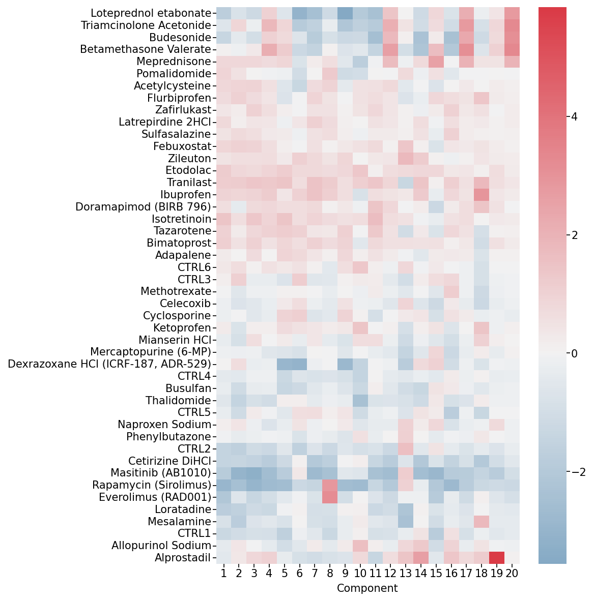
Condition Factors Heatmap. This heatmap shows how each experimental condition (rows) contributes to each component (columns).
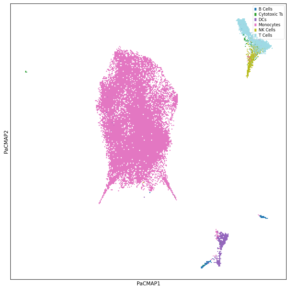
Visualize Cell Embedding
Explore the latent space of cells using nonlinear dimensionality reduction methods such as PaCMAP. Label cells by cell type or experimental condition to understand clustering patterns.
from RISE.figures.commonFuncs.plotPaCMAP import plot_labels_pacmap

fig, ax = plt.subplots(figsize=(8, 8))

plot_labels_pacmap(X, labelType="Cell Type", ax=ax)
plt.tight_layout()
plt.show()
Visualize Eigen-State Factors
Analyze how each cell state contributes to the identified patterns. Each eigen-state represents a summary of similar cells with a distinct expression profile.
from RISE.figures.commonFuncs.plotFactors import plot_eigenstate_factors

fig, ax = plt.subplots(figsize=(4, 4))

plot_eigenstate_factors(X, ax=ax)
plt.ylabel("Eigen-state")
plt.tight_layout()
plt.show()
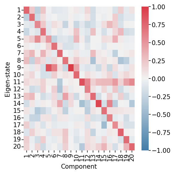
Eigen-state Factors Heatmap. This heatmap shows how each eigen-state (representing groups of similar cells) is related to each component. High values indicate strong association with a component.
Visualize Gene Factors
Identify which genes are highly weighted in each component, revealing coordinated gene modules. Adjust weight values to focus on genes that contribute significantly to the patterns.
from RISE.figures.commonFuncs.plotFactors import plot_gene_factors

fig, ax = plt.subplots(figsize=(7, 8))

plot_gene_factors(X, ax=ax, weight=0.2, trim=True)
plt.tight_layout()
plt.show()

Gene Factors Heatmap. This heatmap shows which genes (rows) are associated with each component (columns). The weight parameter filters out genes with low contributions for easier interpretation.
Interpreting a Component
Investigate Gene Associations for a Component
Overlay specific gene expression on the cell embedding to see which cells express genes of interest for a particular component.
from RISE.figures.commonFuncs.plotPaCMAP import plot_gene_pacmap

fig, ax = plt.subplots(figsize=(8, 8))

gene = "MS4A1"  # B cell marker
plot_gene_pacmap(gene, X, ax=ax, clip_outliers=0.9995)
plt.tight_layout()
plt.show()
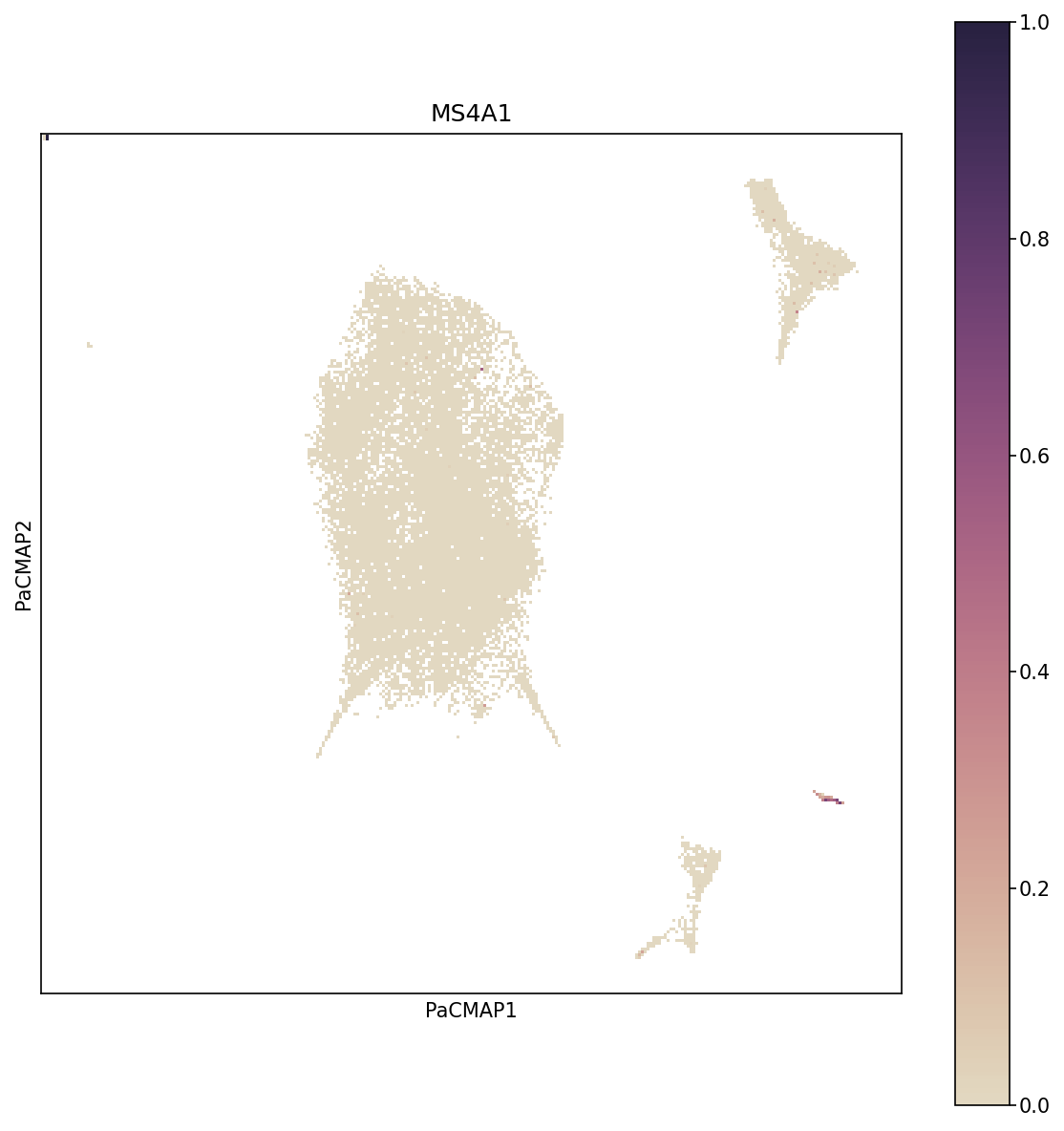
Gene Expression on PaCMAP. This visualization overlays MS4A1 gene expression (a B cell marker) onto the PaCMAP embedding. Cells are colored by expression level, revealing which populations express the gene.
Investigate Cell Associations for a Component
Visualize how cells contribute to specific components using weighted projections, revealing subpopulations with distinct expression patterns.
from RISE.figures.commonFuncs.plotPaCMAP import plot_wp_pacmap

fig, ax = plt.subplots(figsize=(8, 8))

plot_wp_pacmap(X, cmp=10, ax=ax, cbarMax=0.9)
plt.tight_layout()
plt.show()
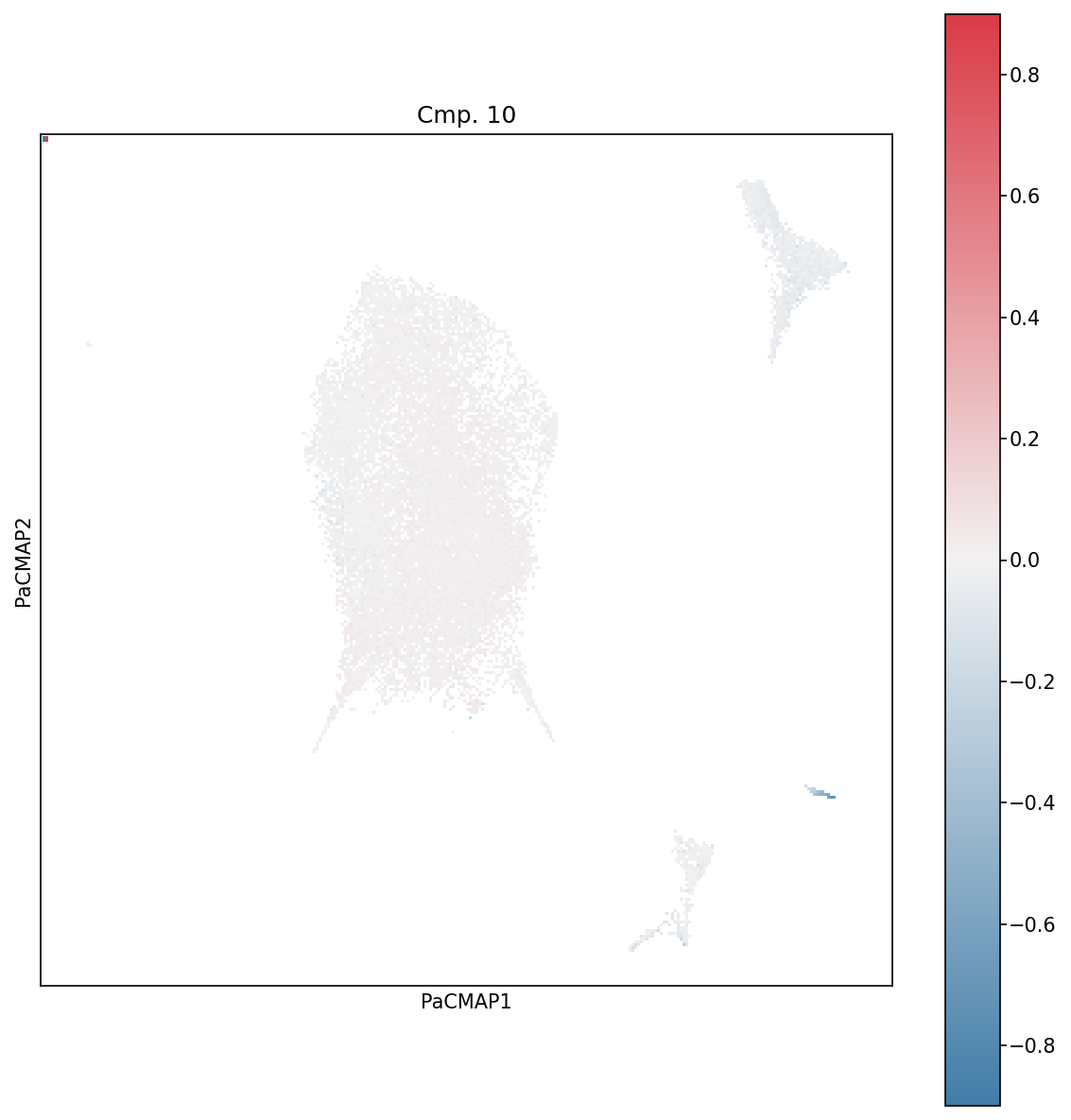
Weighted Projections for Component 10. This plot shows which cells contribute most strongly to component 10. Cells with high weighted projections (bright colors) are most representative of that component’s pattern.